At Dodeline Design here in Charleston, we believe a wedding invitation should feel like the very first step guests take into your celebration. Long before they arrive beneath live oaks or step through the doors of a historic chapel, the paper story has already begun. Thoughtfully integrating your stationery with a wedding venue illustration creates continuity, emotion, and a sense of place that feels unmistakably personal—and undeniably Southern.
Below, we’re sharing our favorite design tips for creating harmony between your invitations and your venue artwork, along with a look at current trends we’re loving in the world of wedding paper.
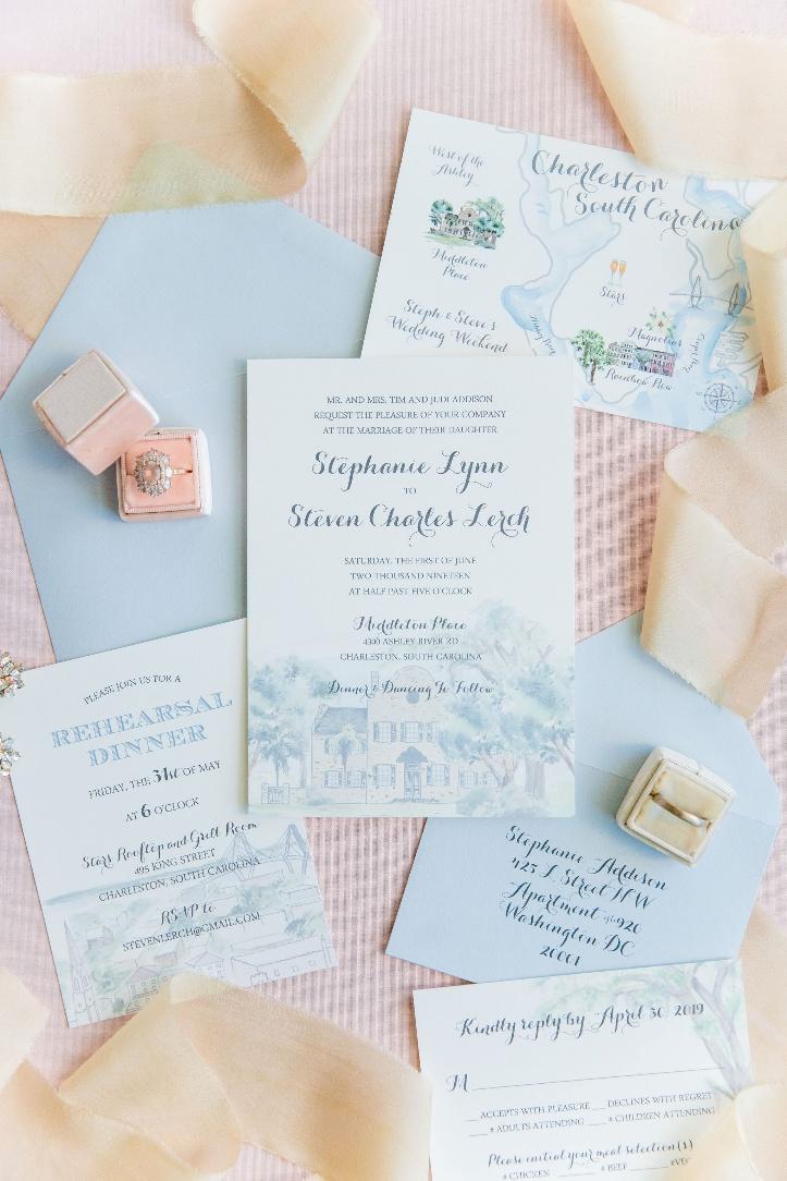
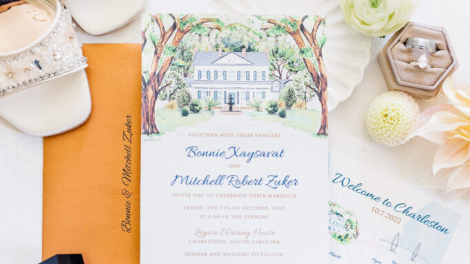
Photo Credit: Dana Cubbage Weddings
Start With the Story of the Place
Every venue has a narrative. In Charleston, that might be a centuries-old home, a coastal marsh, or a candlelit ballroom overlooking the harbor. Before design begins, we always encourage couples to articulate what drew them to their venue. Is it the architecture? The landscape? The way the light falls in the late afternoon?
Capturing that essence is the foundation of a successful wedding venue illustration. A strong illustration isn’t a literal rendering; it’s an interpretation. By identifying the emotional cues of the space, you give your stationery a clear direction and ensure it feels intentional rather than decorative.
Let the Illustration Lead the Suite
One of the most cohesive approaches is to allow the venue artwork to become the visual anchor of your entire invitation suite. When the illustration sets the tone, every other element—typography, color palette, and layout—can respond to it.
This is especially effective for couples drawn to illustrated wedding invitations, a trend that continues to grow in 2026. Hand-drawn venues paired with refined typography strike a balance between artistry and elegance, creating invitations that feel timeless yet distinctive.
Design tip: pull subtle colors directly from the illustration for ink choices and envelope liners. This creates unity without overwhelming the paper.
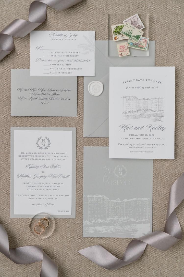 Photo Credit: Abby Murphy Stewart
Keep Color Cohesive, Not Matchy
A common misconception is that everything must match exactly. In reality, cohesion comes from harmony, not duplication. If your venue illustration features soft indigo shadows or warm stone tones, echo those hues lightly throughout the suite rather than replicating them verbatim.
Current trends favor layered neutrals—ivory, sand, pale gray—punctuated by one or two accent colors drawn from the artwork. This approach feels elevated and allows the illustration to shine without competing elements.
Use Scale and Placement Intentionally
How large your venue illustration appears matters just as much as how it’s drawn. A full-bleed illustration makes a dramatic first impression, while a smaller vignette can feel understated and refined.
For formal affairs, we often recommend featuring the wedding venue illustration prominently on the main invitation, then repeating smaller details—arches, rooftops, foliage—throughout the remaining pieces. This repetition reinforces the design story and creates a visual rhythm across the suite.
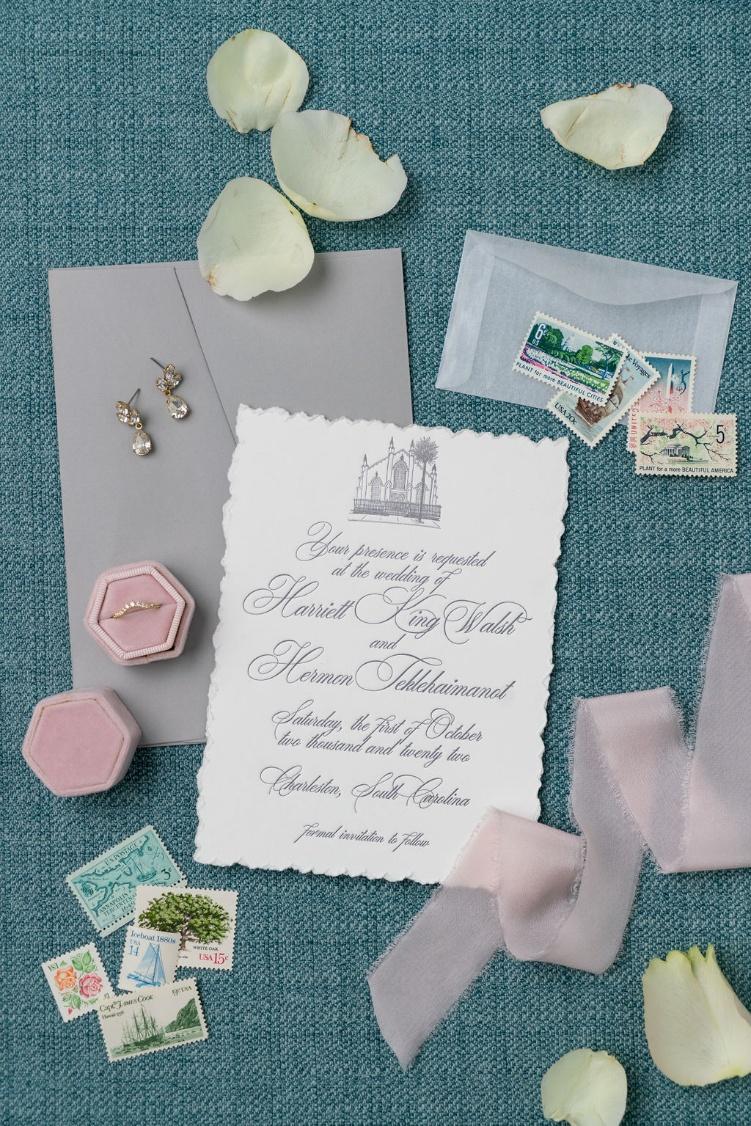
Photo Credit: Abby Murphy Stewart
Pair Illustration Style With Typography
One of the hallmarks of seamless design is the relationship between artwork and type. A loose, painterly illustration pairs beautifully with classic serif fonts or romantic scripts. Conversely, a crisp line drawing feels at home alongside clean, modern typography.
Among the most requested looks this season are illustrated wedding invitations paired with custom monograms or wedding crests. These elements provide structure and balance, grounding the organic nature of hand-drawn art with a sense of formality.
Think Beyond the Invitation
Integration doesn’t stop with the paper you mail. Couples are increasingly extending their venue illustration across day-of details—programs, escort cards, bar menus, and even signage. This continuity elevates the guest experience and makes the design feel immersive.
A refined wedding venue illustration can be adapted in countless ways, from a subtle watermark on ceremony programs to a statement piece on a welcome sign. Designing with flexibility in mind ensures the artwork remains cohesive across formats and scales.
Embrace Texture and Dimension
Another current trend we adore is the use of tactile elements to complement illustrated designs. Soft cotton paper, deckled edges, vellum overlays, and letterpress accents add depth and warmth, enhancing the hand-crafted feel of venue artwork.
Layering a translucent vellum wrap over your invitation, with the illustration faintly visible beneath, creates a moment of discovery—one that feels especially fitting for romantic Charleston celebrations.
Edit With Intention
Perhaps the most important design tip of all: know when to stop. A beautifully integrated suite doesn’t need every possible embellishment. White space, restraint, and thoughtful editing allow your venue illustration to breathe and your design to feel confident.
When the invitation, illustration, and venue speak the same visual language, the result is effortless elegance. Guests don’t just see where they’re going—they feel it.
At Dodeline Design, we see stationery as more than paper. It’s a preview, a promise, and a keepsake. By thoughtfully integrating your venue artwork into your invitation design, you create a cohesive story that begins in the mailbox and continues all the way down the aisle—with a final wedding venue illustration that truly feels like home.

Leave a Reply